Multi-Perspective Preview (MPP)
Multi-Perspective Preview lets editors check a page from several angles without leaving ContentCreator’s in-context preview: at different screen sizes and device orientations, as of a chosen date and time, and as it would appear to a targeted personalization segment. This guide walks through opening MPP and using each perspective.
Overview
When you preview a page in ContentCreator you normally see it exactly as it renders right now, at the width of your browser window. Multi-Perspective Preview (MPP) extends that preview with additional perspectives you can switch and combine:
- Device & viewport — render the page at desktop, tablet or phone sizes (or any custom size), in portrait or landscape.
- Preview date — render the page as of a chosen date and time, so you can see how time-scheduled content will appear before or after a release.
These two perspectives are part of the standard MPP. Each is set from a dedicated MPP toolbar and takes effect immediately in the preview, and they stack: you can, for instance, view the tablet layout on a future date at the same time.
Beyond the standard perspectives, MPP is extensible — a project can add its own perspectives to the toolbar. The personalization segment preview described later in this guide is one such extension: it is not a standard MPP feature, but an example of what a project can plug in.
Opening Multi-Perspective Preview
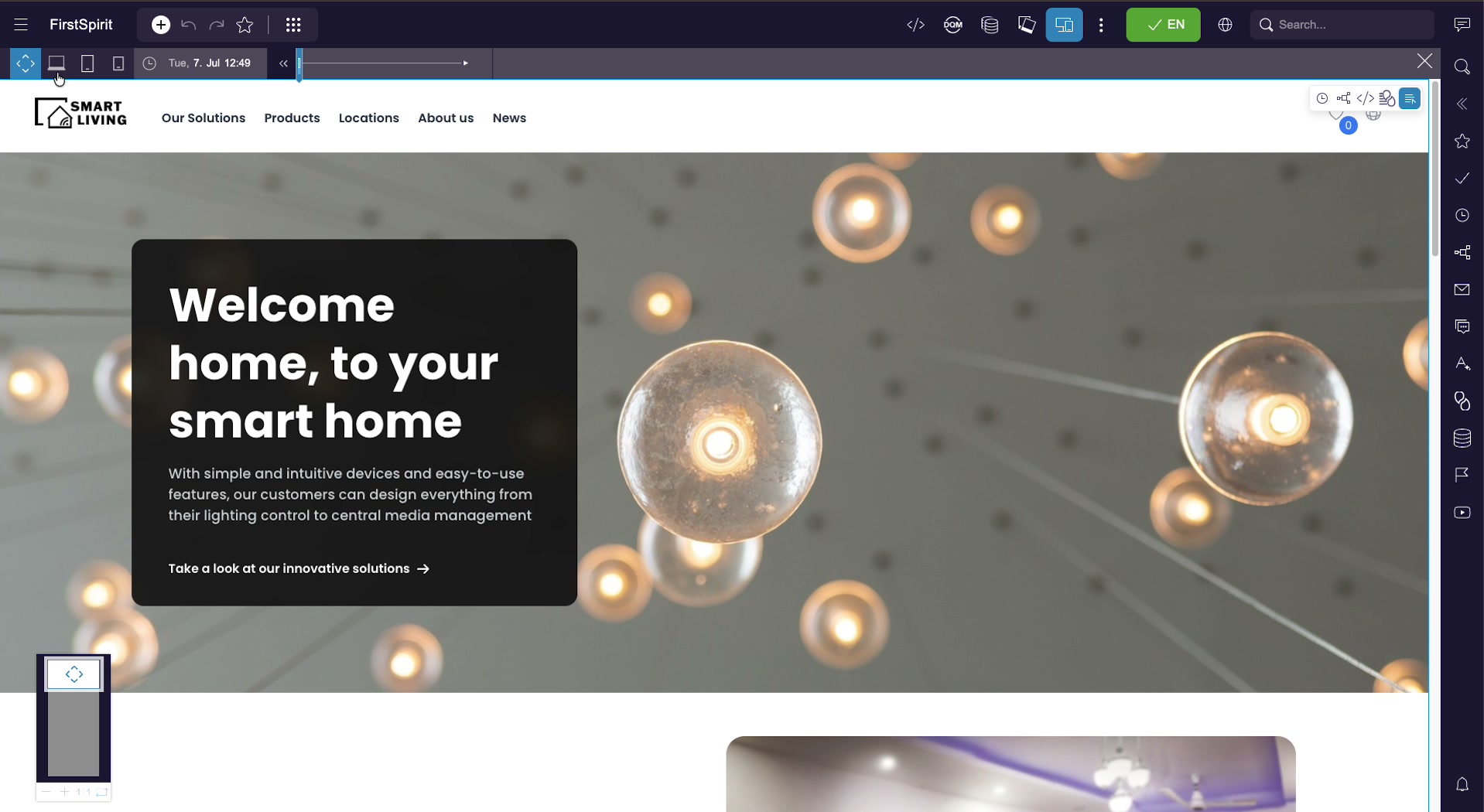
Open any page in ContentCreator’s preview, then click the device / Multi-Perspective Preview button in the top toolbar (the screen-with-a-second-screen icon). ContentCreator adds the MPP toolbar directly beneath the main toolbar.
The MPP toolbar is organized left to right:
- Viewport modes — free resize, desktop, tablet, phone.
- Preview date — a clock icon with the currently previewed date and time, plus a timeline slider to scrub the date backward and forward.
- Personalization — a segment selector. This is a project-specific extension, not a standard part of MPP; it appears only when it has been added to the project (see Personalization preview).
- Close — the
×button on the far right returns you to the normal preview.
Device & viewport preview
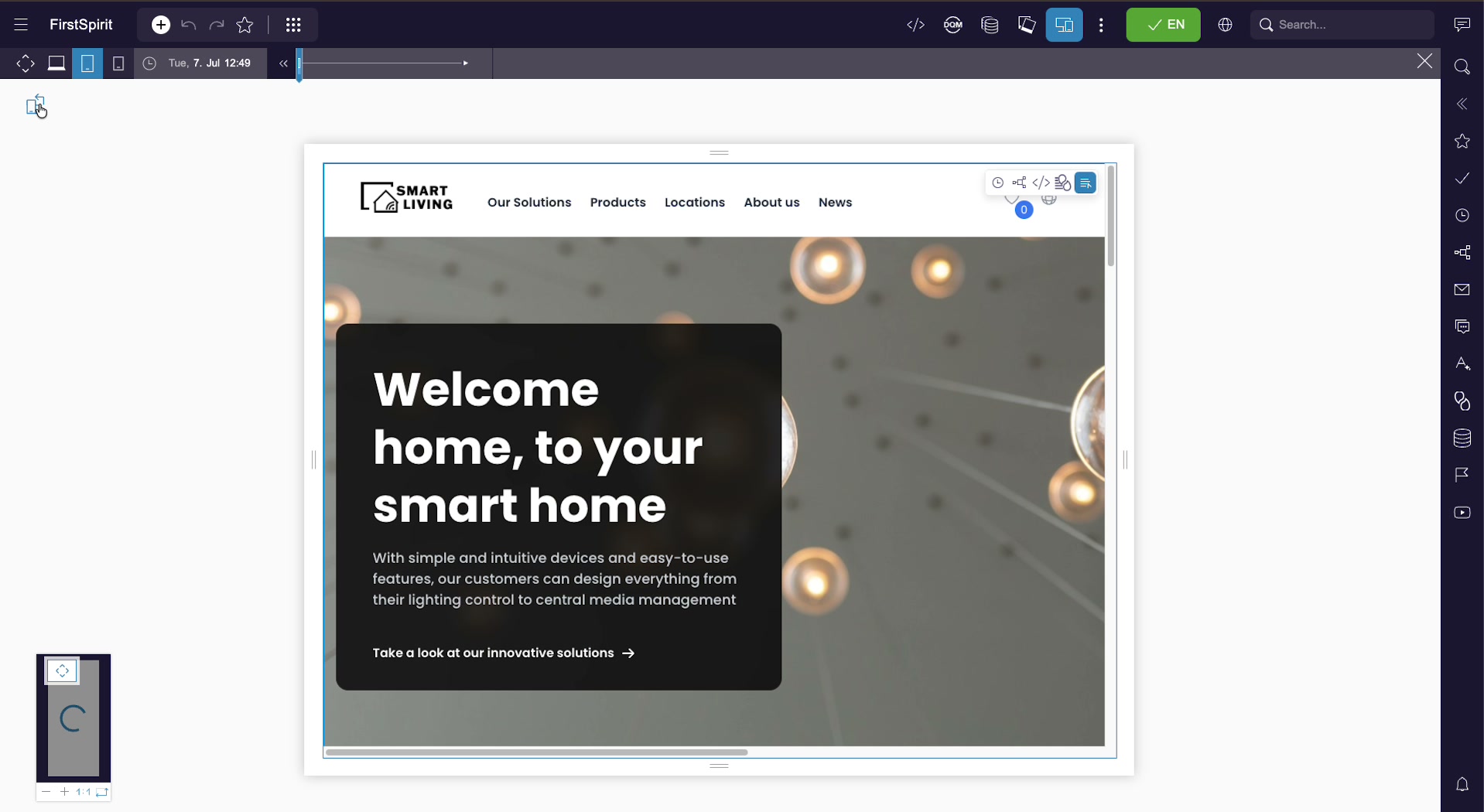
The viewport controls at the left of the MPP toolbar reflow the page into different screen sizes so you can check responsive behaviour without a physical device.
Viewport modes
| Mode | What it shows |
|---|---|
| Free resize | Drag the preview edges to any width and height; useful for finding breakpoints. |
| Desktop | A standard large-screen viewport. |
| Tablet | A tablet-sized frame, resizable and rotatable. |
| Phone | A phone-sized frame, resizable and rotatable. |
Resizing, rotating and zooming
In a device mode the page appears inside a resizable frame with drag handles on the sides, top and bottom. A rotate control (top-left of the frame) switches between portrait and landscape. The zoom controls in the lower-left corner (− / + / 1:1) scale the whole preview so a large viewport still fits your screen; a small draggable thumbnail lets you pan around when the preview is zoomed in.
Preview date (time-based preview)
FirstSpirit content can be scheduled to appear or disappear on given dates — for example a campaign banner that goes live next week, or an announcement that expires after an event. The preview date lets you see the page exactly as it will render at any point in time.
Setting a date and time
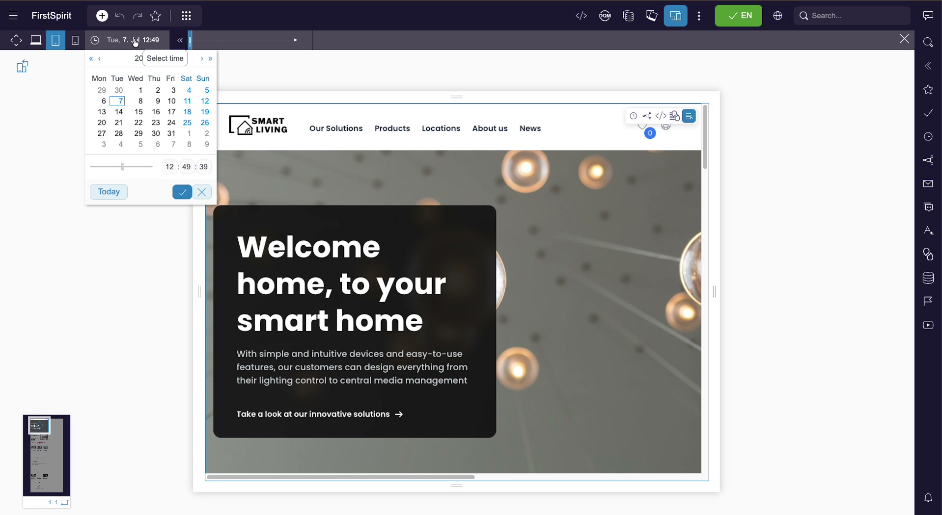
- Click the clock / date control in the MPP toolbar (it shows the currently previewed date, e.g.
Tue, 7. Jul 12:49). - Pick a day from the month calendar. Use the arrows to move between months and years, or Today to jump back to the current date.
- Set the time with the hour : minute : second fields or the time slider.
- Confirm with the check button (or cancel with
×). The preview re-renders as of that moment.
You can also scrub the date quickly with the timeline slider next to the date control, moving the previewed moment backward and forward without opening the calendar.
Note: The preview date affects only date-driven rendering (scheduled visibility, dated content, and anything your templates derive from the current date). It does not change server time or publishing.
Personalization preview (segments)
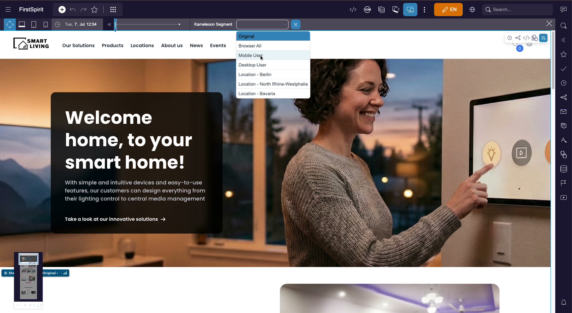
Because MPP is extensible, a project can add a segment selector to its toolbar — for example by connecting a personalization service — so editors can preview the page as it would be served to a particular audience. In the example shown here the connector is Kameleoon and the selector is labelled Kameleoon Segment; a different project could integrate a different service, or none at all.
Choosing a segment
Open the segment dropdown and pick the audience you want to preview. The page immediately re-renders with the content, layout and media targeted to that segment — personalized variants, segment-specific sections, and any navigation differences all appear as the visitor in that segment would see them. The example project offers segments such as:
- Original — the default, non-personalized page.
- Browser All, Mobile User, Desktop-User — device / browser based audiences.
- Location – Berlin, Location – North Rhine-Westphalia, Location – Bavaria — location based audiences.
The segments available depend entirely on what has been defined in the connected personalization service; the list above is illustrative and specific to the example project. A small status badge in the lower-left corner of the preview shows which segment is currently applied.
Combining perspectives & closing MPP
The perspectives are independent and combine freely. With the standard MPP alone you can, for example, switch to the phone viewport and set the preview date to a campaign’s launch day to see the mobile layout as it will appear when the campaign goes live. Where a project has added the personalization segment extension, you can layer a location segment on top of that to also see the audience-targeted variant.
Each setting stays applied until you change it, so you can move through devices while keeping the same date (and segment, if the extension is present), or vice versa.
To leave Multi-Perspective Preview, click the × button on the far right of the MPP toolbar. The preview returns to its normal state — current date, live segment, and your browser’s own window size.
Toolbar controls reference
| Control | Location | Purpose |
|---|---|---|
| Open MPP | Main toolbar | The screen / device icon; opens the MPP toolbar. |
| Free resize | MPP toolbar, left | Drag the preview to any custom width and height. |
| Desktop / Tablet / Phone | MPP toolbar, left | Render the page at a preset viewport size. |
| Rotate | Preview frame, top-left | Switch the device frame between portrait and landscape. |
| Zoom (− / + / 1:1) | Preview, lower-left | Scale the preview to fit; drag the thumbnail to pan. |
| Preview date | MPP toolbar, center | Clock icon + date; opens the calendar and time picker. |
| Timeline slider | MPP toolbar, center | Scrub the previewed date backward and forward. |
| Segment selector | MPP toolbar, right | Preview the page for a personalization audience. Project-specific extension — present only when added to the project, not part of standard MPP. |
| Close (×) | MPP toolbar, far right | Exit Multi-Perspective Preview. |