ContentCreator: An Introduction for Editors
ContentCreator is FirstSpirit's in-context editor: you work directly on a live preview of your website, editing text, images, and structured content in place. This guide walks through the interface and every everyday task — navigating your site, editing content and media, working with datasets, and publishing — no technical knowledge required.
Overview
ContentCreator lets you edit your website directly on a live preview — what you see is what your visitors get. There is no separate back-end form to fill in: you click the element you want to change, edit it in place, and your change appears immediately in the preview.
You launch ContentCreator from the FirstSpirit start page. This guide is for content editors and authors, and covers the interface and the everyday tasks: navigating your site, editing text and images, managing the Media library, working with datasets, and publishing your changes.
The Editor at a Glance
ContentCreator is organised into four areas.
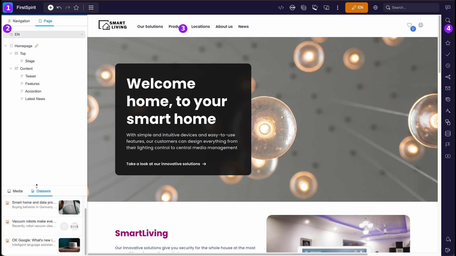
| # | Area | What it does |
|---|---|---|
| 1 | Toolbar & edit mode | Across the top: switch between preview and edit mode, undo/redo, bookmark the page, create new pages and media, change the content language, and search. |
| 2 | Navigation / Page | On the left: the Navigation tab shows your site tree; the Page tab lists the sections of the current page. The Media and Datasets tabs sit at the bottom. |
| 3 | In-context preview | In the centre: the live page. Click any editable element to work on it directly. |
| 4 | Reports & workflows | On the right: tasks, bookmarks, edit history, search results, and workflow actions. |
Edit Mode & Preview
ContentCreator has two states, controlled by the toggle at the top right (next to the language):
- Preview — view the page exactly as a visitor sees it, and click through links to browse your site.
- Edit mode — editable areas highlight as you hover over them, ready to be changed.
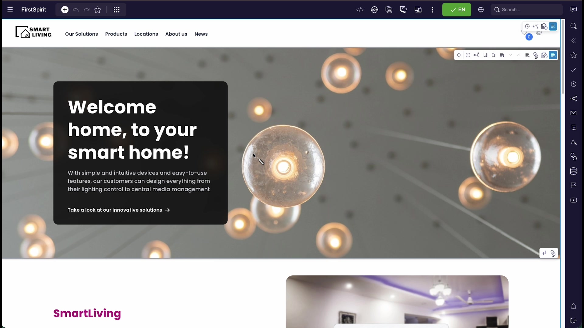
Other toolbar controls:
| Control | What it does |
|---|---|
| Undo / redo | Step backward and forward through your recent changes. |
| Bookmark (star) | Save the current page for quick access later. |
| Language | Switch the content language you are editing. |
| Search | Find pages, media, and datasets across the project. |
Navigating Your Site
Use the left panel to move around your site. It has two tabs:
- The Navigation tab shows the page tree (menu structure) of your site. Click a page to open it in the preview.
- The Page tab lists the sections of the current page, so you can jump straight to one.
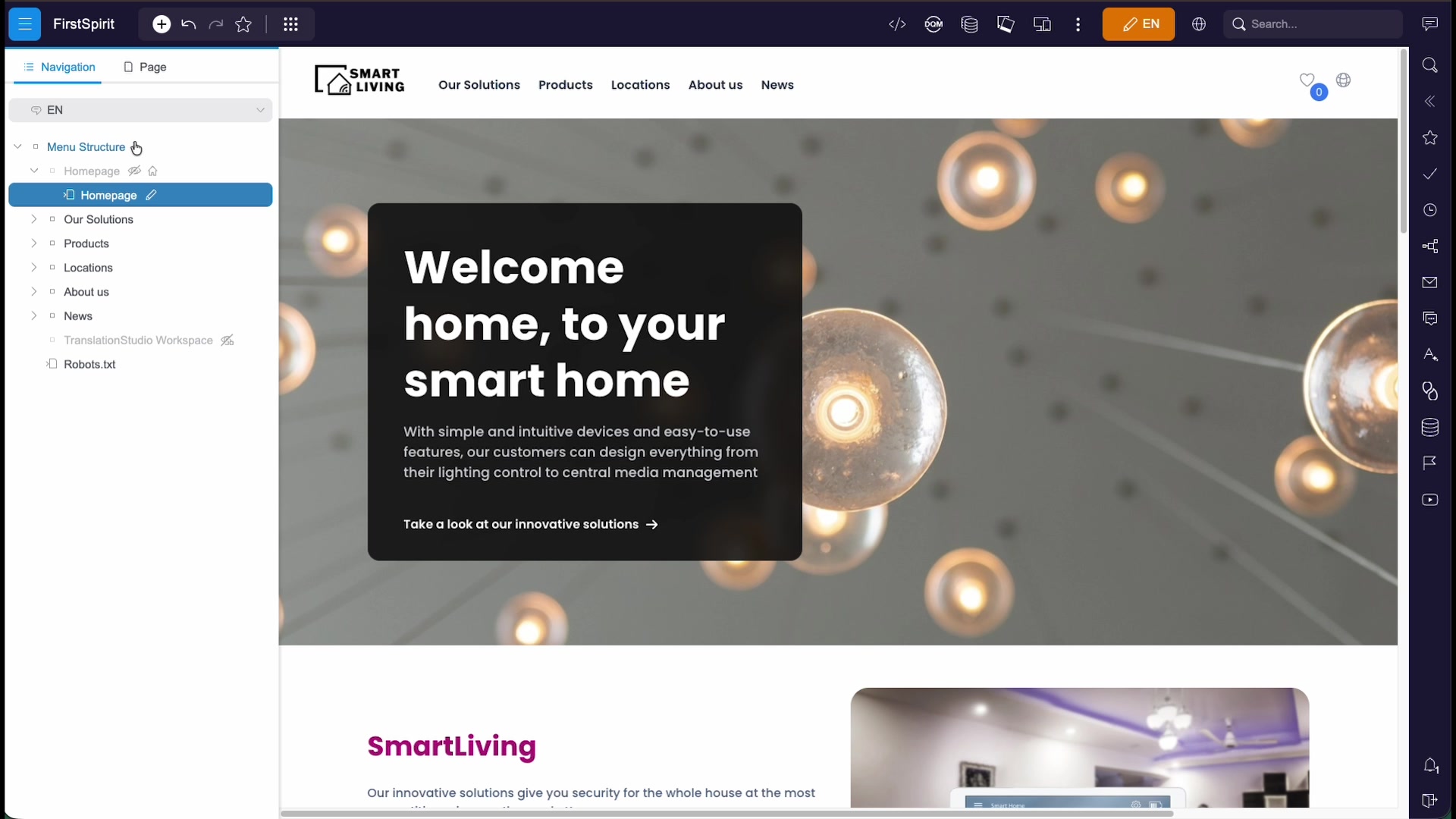
You can also navigate simply by clicking links in the preview, just like a visitor would.
Editing Text
In edit mode, hover a content element to highlight it, then click it (or its edit pencil) to open the edit dialog. Each field maps to what you see on the page — for example a section's headline, sub-heading, body text, and call-to-action link.
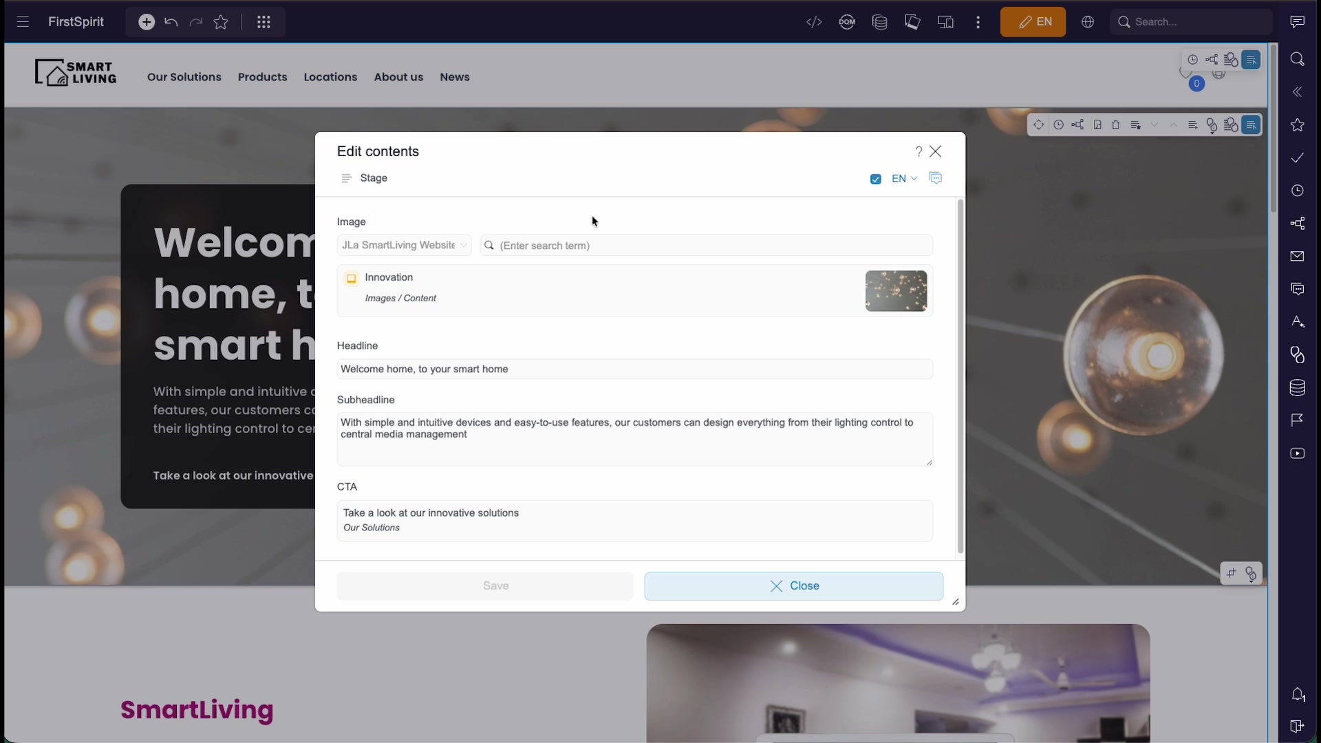
Edit rich text with the inline formatting controls (bold, italics, lists, links), then click Save to apply your change, or Close to discard it. Your change appears in the preview immediately.
Editing Images
Image elements open an Edit image section dialog. Pick an image from the Media library, then choose the crop resolution you need — a section can offer several (for example 16:9, 16:6, 4:3, or 9:16).
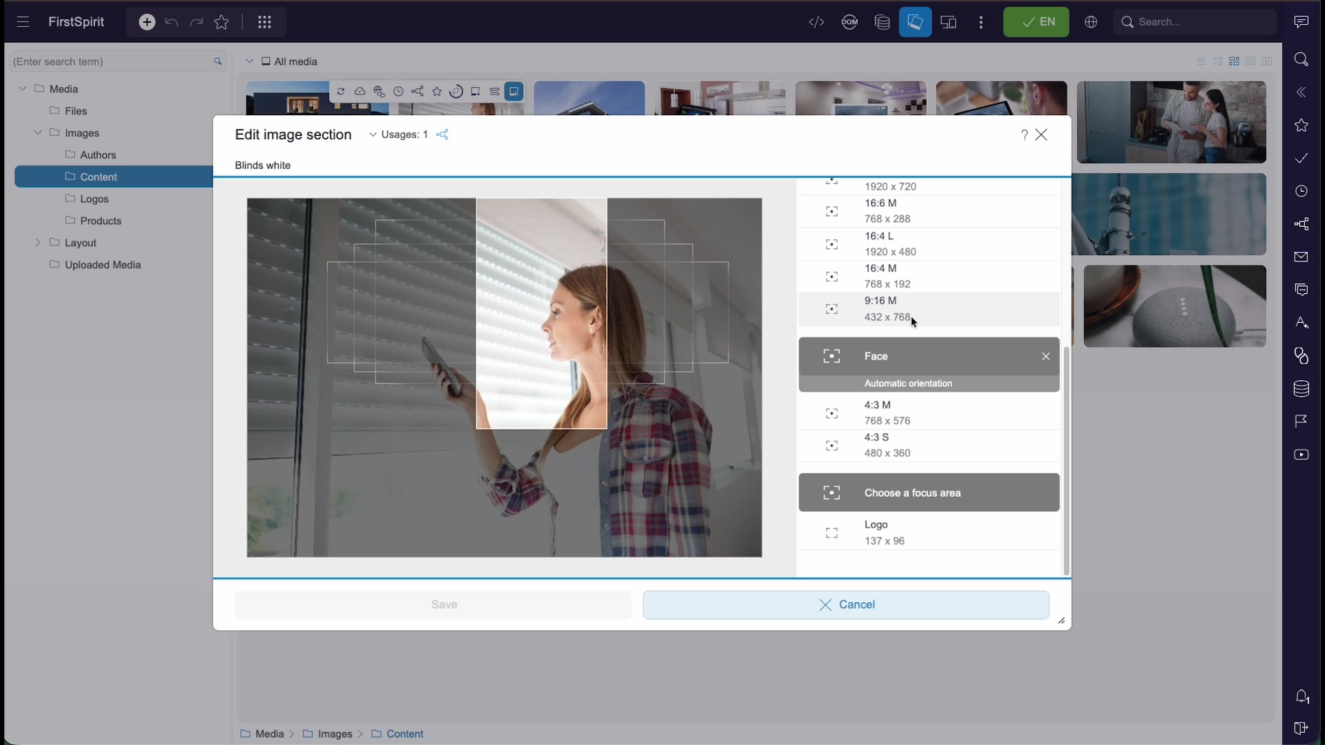
The Face / Automatic orientation option keeps the subject centred automatically; Choose a focus area lets you set the important part of the image by hand, so every cropped version keeps it in view.
The Media Library
The Media tab (bottom left) opens the Media library, where all images and files are organised in folders such as Images, Logos, Products, and Uploaded Media.
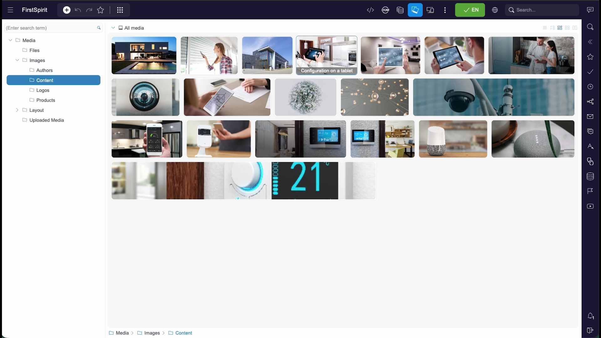
Search for an asset by name, preview it, and reuse the same file on many pages. When you update a shared asset, every place that uses it is updated too.
Managing Sections
A page is built from sections stacked in a content area. In edit mode, each section shows an inline toolbar when you hover it:
| Action | What it does |
|---|---|
| Edit | Open the section's edit dialog. |
| Move up / down | Reorder the section within the page; the preview reflows instantly. |
| Add | Insert a new section from the available section templates. |
| Delete | Remove the section from the page. |
Creating Pages & Media
The + (new) button in the toolbar lets you create content from anywhere:
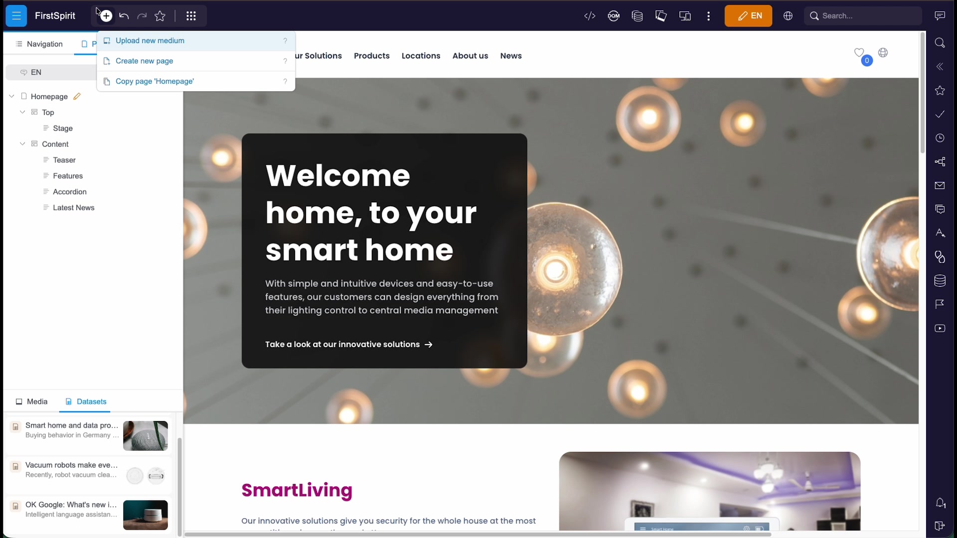
- Upload new medium — add an image or file to the Media library.
- Create new page — add a new page to your site, based on a page template.
- Copy page — duplicate the current page as a starting point for a new one.
Datasets & Data Sources
Some content — news articles, products, locations, authors — is stored as datasets in data sources, rather than as sections on a single page. This keeps structured content reusable and consistent.
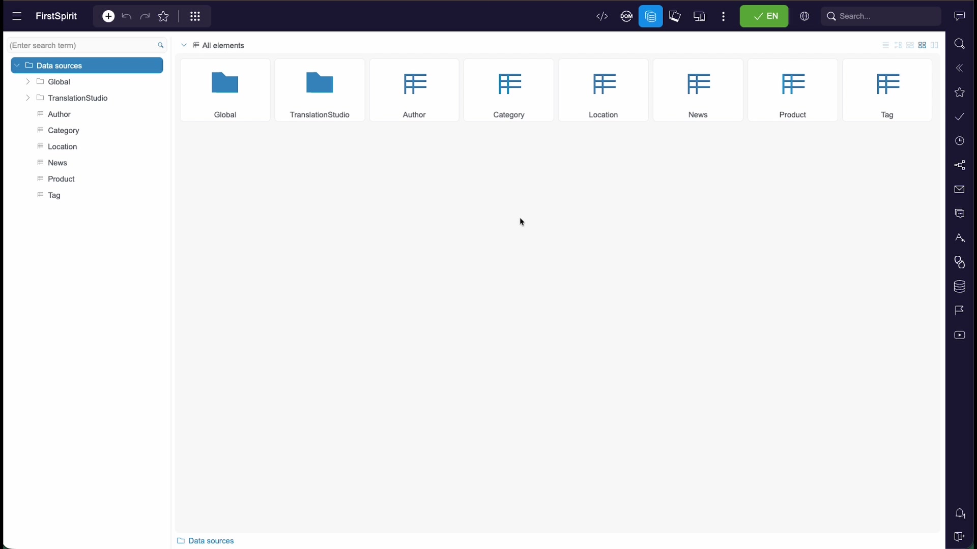
Open a data source to see its entries in a table, and select one to edit its fields in a form.
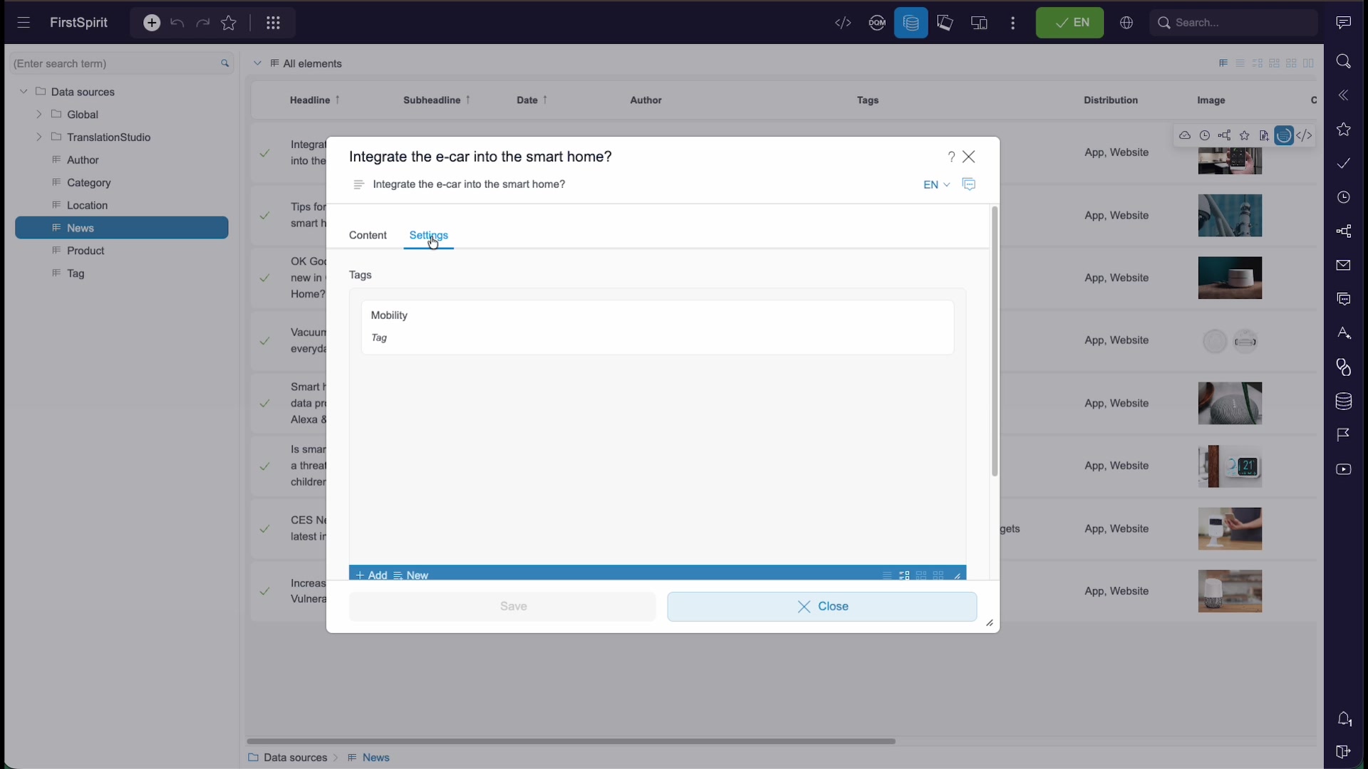
Datasets use the same field types you meet elsewhere in the editor — text fields, rich text, media pickers, and specialised inputs such as a date picker.
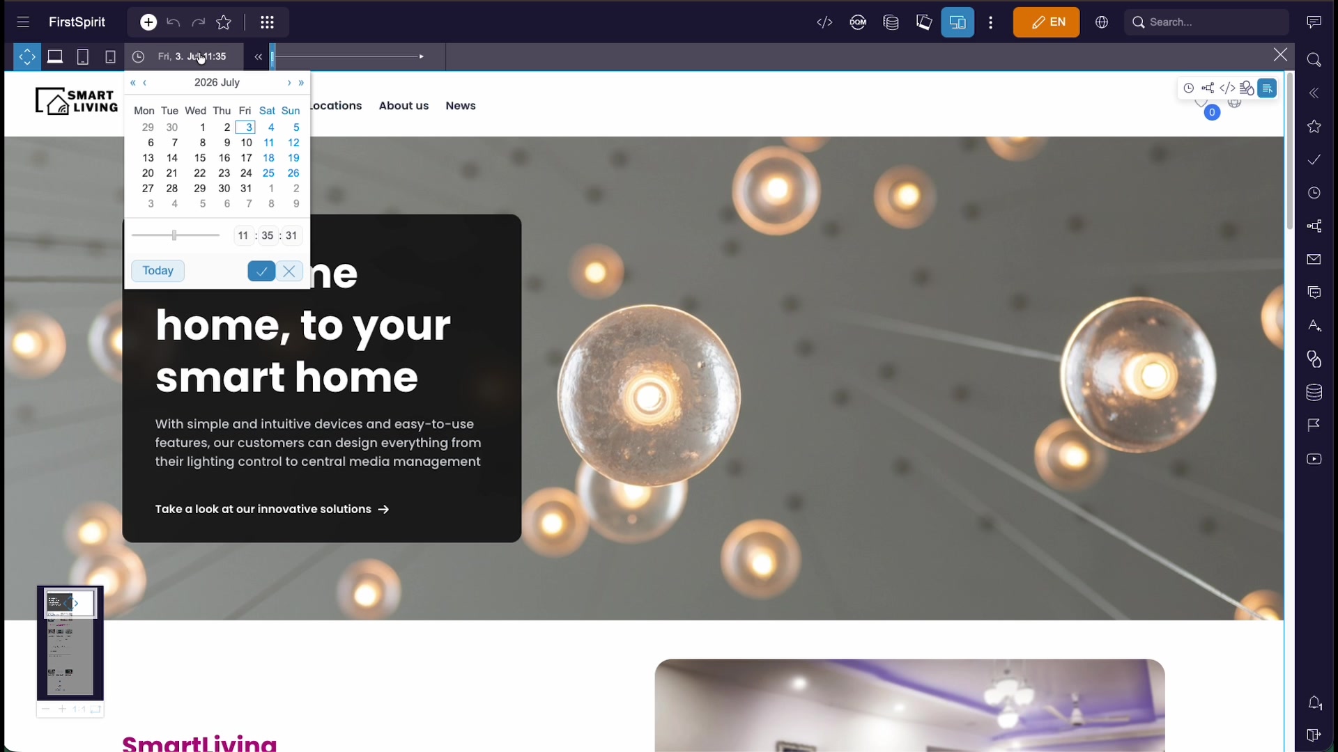
Reusing Datasets in Lists
Because datasets are stored centrally, the same entry can appear in many places at once. A section such as a "Latest News" list pulls in the newest dataset entries automatically — you don't rebuild the list by hand.
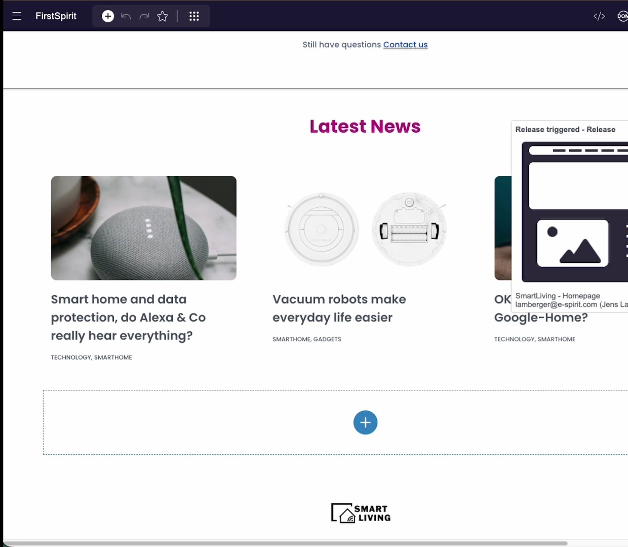
To change what appears, edit the underlying dataset — the lists that reference it update everywhere.
Structured Sections
Beyond plain text and images, sections can present structured content. An accordion or FAQ section, for example, holds a list of question-and-answer items that visitors can expand.
You edit these the same way as any other section: open the edit dialog, add or reorder items, and save.
Search & Reports
The report rail on the right and the search box at the top help you find and track your work.
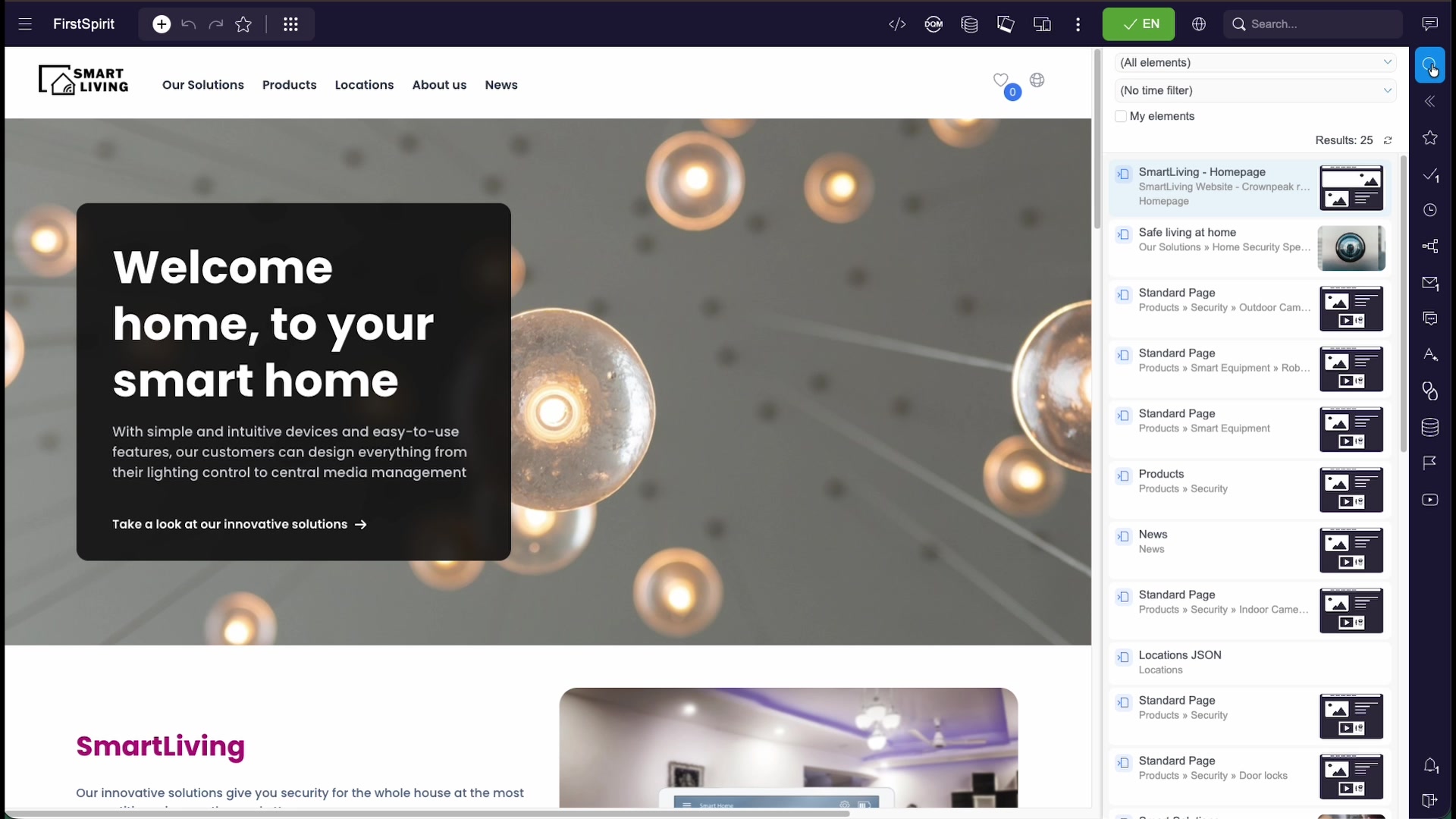
- Search finds pages, media, and datasets by name.
- Bookmarks collect the pages you starred for quick return.
- History shows recently visited and recently edited content.
- Tasks list the items assigned to you through workflows.
Publishing & Workflows
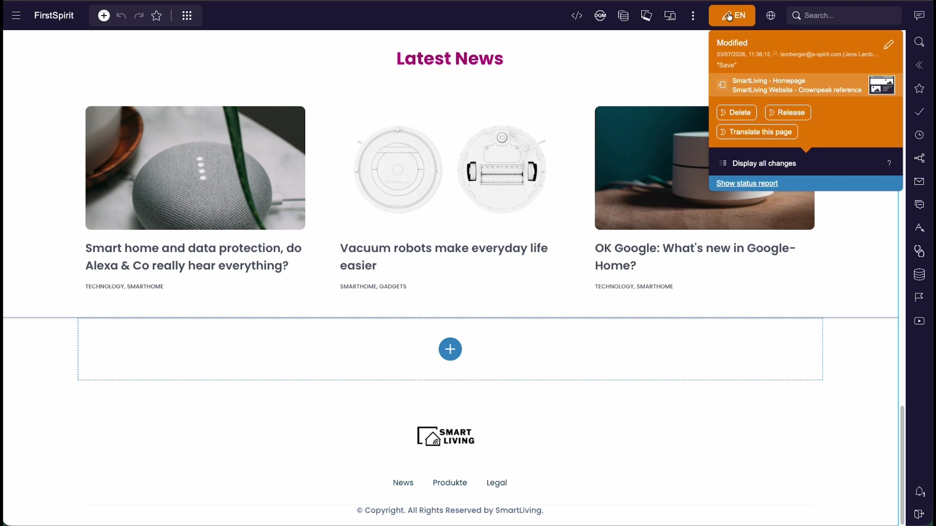
Your edits stay in a private preview until you release them. Workflows move content through your team's process and, finally, to the live site.
- Release — when your changes are ready, start the release workflow to publish them.
- Review & translation — workflows can route content to a colleague for approval, or into translation, before it goes live.
- Tasks & history — track what is assigned to you and review the recent change history of a page from the report rail.
Resources
- This is an introduction to everyday editing. To configure which functions are available to which user groups, see the ContentCreator Tailored UI Reference.
- The exact sections, data sources, and workflows you see are defined by your project template and set up together with FirstSpirit support.